Monday 28 November 2016

Title Sequence Analysis


Title Sequence Analysis- The Girl with the Dragon Tattoo


The use of grey coloured font on a black background has the connotations of mystery, sci-fi and dullness. The text could also link to the tattoo or be used in order to describe a character's personality. The title has then being edited to fade out, implying the death or loss of a character. The dark colours further suggest that there in no purity within the film and everything has an underlying dark meaning.


The camera then moves to a close up of a character being gagged and struggling to move. This helps express how the character has no power or control over their situation. This technique is used to make the audience wonder what is happening and make them want to watch all the film to find out.


The camera is now positioned at a high height which is used to give the audience a wider view of the shot. This shot also shows 2 character joined together due to the black oil. It could also be used to show the aftermath of an event that previously occurred. This reinforces the horror genre and creates a sense of darkness. The high angle shows the people submerged in darkness, laying helpless and insignificant.

Fast paced editing then introduces a close up of a skull on fire, which is used to isolate detail. This shot also expresses the reaction on the skulls face and links into the genre of the film been horror. The crescendo of the music reaches a tense point, reflecting the horror genre.The special effect of the fire suggests burning. The iconography of the skull connotes violence and implies something bad will happen to the protagonist

This shot shows a character face, using a close up. This shot is used to show the characters reaction. This shot may also be used to show the emotion on the characters face.                                                                                                                                                                                                 
This shot shows someone’s hands grabbing someone or something else. This is effective as it builds tension and makes the audience want to continue watching to see who is been grabbed and what happens after that. The close up shot isolates the detail of the hand and could show who the character is.

This close up shot is used to show the emotion on the characters face. This shot shows the audience the significance of the eyes, as they can get a clear view of them. The character is looking into the audiences eyes which shows the shot is directed at them and they need to continue watching.

Film title sequence analysis

Film Title Sequence Analysis


Insidious Title Sequence

A fade in is used to reveal the production companies that are involved with the film. The colour of the font is in red which connotes danger, already setting a foreboding atmosphere. Eerie non-digetic music is used which clash together to provoke an unsettling response and implies that something is not quite right. There is a clear contrast between the black background and the red text which creates juxtaposition. Both colours are known for their bad connotations. 

The camera moves down vertically to reveal a spherical light shade which is contrasted with the jet black background. This could possibly elicit a clear binary opposites of good vs evil. The camera spins around to reveal that it is handing from a ceiling and establishes a child's bedroom. A young boy is seen to be in bed sleeping with a night light on the left side implying that he could be scared of the dark. 

The camera then tracks to the right around the dark house revealing a mysterious figure outside the window. This straight away intrigues the audience because they don't know what the source is . The strange figure suddenly shifts and the camera follows to a indistinguishable malformed face which is lit up below by a candle.
A fade to black is used to reveal the name of the film 'Insidious' with the text being red again to connote danger and is also juxtaposed with the black background again. This is a jump scare because there is an abrupt change in image in conjunction with a loud frightening sound. This is used to scare the audience because they're not expecting anything to happen. The title of the film also seems to be flickering which alludes to a near light source.

A fade to black is used to reveal several stills from the film and the first one is a black and white image of a house along with a non diegetic high key sound to create suspense. This could establish where the main focus of the film will be.


A fade is used to follow up to a next still from the film and reveals a baby crib illustrating that there is a baby involved. The framed picture hanging by the door suddenly tilts out of position which could be used to foreshadow that something bad will happen. There also seems to be a spot light on the crib to make it the main focus.


 A fade is used to reveal the next still from the film showing a room with windows opened considering that the curtains are blowing inwards. This is the first time we see a person in the stills who is unrecognizable. This creates a foreboding atmosphere for the viewers because they don't know who it is.


A fade is used to reveal the next still from the film showing possibly a bedside cabinet with toys such as a teddy bear, cartoon figures and books. There are also some drawings done in crayons which are quite unsettling and provoke an immediate chilling response. The ears are ripped from the teddy implying violence.


The next still is in a dining room featuring a chandelier, framed photos hung on the wall and some interior plant. One chair is seen to be moving by itself implying that a supernatural force is present. This straight away establishes antagonistic elements. The few shots followed on also show objects moving by themselves such as a light hanging by the ceiling showing malevolent activity.
 In the next still from the film we see a framed photo of a happy family of four, a man, woman and two young boys. This clearly implies that they are somehow going to be involved in the film. This is juxtaposed with the telekinetic activity in the previous stills because they are facing a greater force.


Title Sequence Analysis

Title Sequence Analysis


I chose this short film as it seems like a thriller/horror so fits in with our film and will help me to notice stereotypical elements included in this genre’s title sequences. It first starts off with an establishing shot, we see its an empty field covered in snow, this creates a sense of isolation and makes the viewer feel alone. The font included is simple, and red which usually connotes death and blood, it contrasts against the snowy white background as white and red are opposites. Non-diegetic eerie music kicks in creating suspense and you can hear the diegetic sound of drizzling rain which adds mystery to what the film could be about.
You can then see that the noise in the previous shot is from it snowing, as this next shot starts, you can hear the diegetic sound of the stream flowing, this also adds to the theme of isolation as you can tell the film will be set in a rural  and unpopulated area.

There is a sound bridge as the stream running continues into this shot, we see red running in the water which looks like it could be blood,  this also ties in with the titles being red. It also connotes that there will probable be a death in the film giving away a small part of the plot and keeping the audience intrigued. There is then a quick jump cut to closer into the river focusing on the blood running through, it leads you to believe this blood is a key theme throughout the film.
It then cuts back to the extreme long shot of the stream and the title is then shown in the same font as previous shots, and we find out the film is called ‘Blood Drive’ which hugely links into the blood running through the stream. The non-diegetic music playing gets louder as the title sequence is ending and then it fades to white


Friday 25 November 2016

Analysis of a Title Sequence

The short film "Don't Move" is set on one fateful night, six friends gather for their monthly 'games night'... and accidentally unleash a demonic force that might tear them - and their friendships - to pieces. 'Don't Move' is the 8th slice in Bloody Cuts' anthology of short horror films, made by a team of UK film-makers on low budgets. Directed by Anthony Melton, Produced by Ben Franklin and written by David Scullion it stars Rachel Bright and Jake Hendriks alongside Kate Braithwaite, Beth Cooper, Ian Whyte, Calvin Dean and Martin Skipper.

The beginning title sequence starts with a dark red hue with the effect of blood in water as the "cloudy" looking parts move on the screen. The first writing to appear is the name of the film production company, "Bloody Cuts". The writing is in capital letters in white so that it stands out from the background colour, the white also goes well with the colour. The screen then continues to name the actors in the centre of the screen with the same font, colour and capital letters. This continues until all the actors are named, the reason why they are in the centre is because it makes the audience focus on the names and because the background is all the same colour. This is known as a 'credits over blank screen' title sequence. This type of title sequence is often used for thrillers as people make their own judgement of the film by the colours, font and sound involved. When the title of the film company appears the sound of a glass cup scraping and then someone speaking "Oh my god, it's working". The glass scraping then continues as the actors names appear until someone else then speaks "Look at it, it's fucking disgusting". Then the sound of a demon like presence and screams are heard followed by the sound of stabbing. 


After the actors are named on the screen, the title of the film appears. However, it doesn't appear straightaway in your face, it appears one letter at a time. A misty white appears and then the word "Don't" and then soon appears the next word in the same way, "Move". Heavy breathing is heard as the title begins to appear and then as the words of the title individually appear someone says "Don't" and then "Move" in time with when they appear. 


A heavy low pitched sound then introduces the next shot, a ouija board and playing cards covered in deep red blood. The camera pans over the board and reveals a spinning glass which links in with the title sequence. It could be argued that this is also a discrete title sequence because from the voices in the title sequence to getting to the clip of the ouija board it's obvious that the situation happened just before getting to this clip of the board. However, a discrete title sequence is known as a mini film before the actual film foreshadowing what is going to happen, and this includes separately filmed clips so it could be argued that it is not a discrete title sequence because there were no clips, just voices. Then again, it could also be argued that this is a narrative opening sequence because there were characters speaking. This allows the audience to make a judgement of the characters before they see them in the film, however it seemed that the voices gave the audience more of an insight to the film and not the characters. The shot then fades out and the next shot fades in to reveal a note saying "5 Must Die, 1 Must Live, I AM HERE" covered in blood. Various whispers of what the note says is also heard. No more writing appears and the shot then fades out to start the film. 


This title sequence is very effective, it doesn't reveal too much about the film but it hints to the audience what it is potentially about. Since this film is very similar to ours, using a title sequence like this would be very effective for our film. When the film ends, the ending title sequence opens up. It starts with a cloud of blood revealing the letters on a ouija board and after watching the film it is clearly symbolic and has connotations of the superstition that ouija boards can cause your death. The ending sequence includes more graphics but if the opening title sequence has this manny graphics it would have made the film more obvious and less tense as more would have been opened up to the audience. 
 The title of the film appears with a firework looking effect revealing it and then the words become clear, with the director's name below. The same deep red hue from the beginning, and throughout the film, is kept as the background. The screen fades to reveal the main producers and editors of the film one by one, each one on a separate screen with a separate pattern. The patters are iconic as they are patterns on a ouija board which audiences will recognise, especially the sun and the moon. 


Tuesday 22 November 2016

Research into Title Sequences

The main purpose for a title sequence is to display and acknowledge the people featured in and that have helped to develop a film. A title sequence can contain any number of titles, sometimes just including the title and director, or other times involving down to such roles as make-up artist and location photographer. The title sequence can also be used to tell the audience the genre and what to expect within a few seconds, however this is mainly used in TV shows and this has proven to be successful with the opening sequence to a popular American TV show, "Dexter".

  The show follows a serial killer who also works in the Miami Metro police department as a blood splatter analyst. The title sequence is simple, it shows Dexter's morning routine as the credits roll but what makes this sequence the perfect fit for this show is the little details. Firstly, his face is never shown in focus until the very end when he leaves his apartment. Secondly, there are extreme close up shots that show his blood dripping in the sink after cutting himself whilst shaving, the blood is dripping next to the plug hole which is a well known famous shot from the horror film 'Psycho'. Other extreme close up shots include his hands gripping onto the cafetiere to connote his physical strength, the knife as he cuts into a blood orange, ketchup dripping onto his plate that's made to look like blood and a shot of him locking his door with the key which connotes he hides who he truly is which is made obvious after watching the show. The show has won various awards since first airing in October 2006 but the title sequence alone won two OFTA Television awards in 2007 for Best New Theme Song in a Series and Best New Titles Sequence in a Series as well as a Primetime Emmy Award for Outstanding Main Title Design. 

Discrete title sequence
These are separately filmed clips that are played before the film starts. It's usually there to set the mood and tone for the rest of the film. It's known as a mini film, before the actual film. An example would be James Bond: Skyfall, the title sequence of Skyfall sets the mood for the rest of the film due to the sound, editing, cinematography and mise-en-scene. It includes a professional feel to the characters for wearing smart clothing whilst being surrounded by graves, weapons and blood. The music by Adele sets a suspense mood and the editing and cinematography is done to manipulate the audience, James Bond steals the title sequence by featuring in it the most therefore allowing the audience to recognise who we will expect to see the most of in the actual film, it almost foreshadows the film.

Stylised
A stylised title sequence is something that relies mostly on it's editing to set the mood. A lot of the editing is used within the front and text shown, for example if it's sharp lettering people will assume the film will involve danger. It seems as though the text is within the scene itself. An example would be Zombieland.

Credits over a blank screen 
This is more of a suttle title sequence, it tends to involve a blank screen with a contrast colour writing. The mood depends upon the colours and sound used to set the tone. Sometimes this can be effective for thrillers as people have to make their own judgement of the film by the colours, font and sound involved. Narrative opening This is also another simple but effective way of a title sequence because there is someone actually speaking to the audience. This allows the audience to make a judgement of this character before they are introduced as an actual character in the film. This is done by the tone of their voice, whether their male or female, young or old. It allows the audience to get an insight to the character.

Narrative opening
This is also another simple but effective way of a title sequence because there is someone actually speaking to the audience. This allows the audience to make a judgement of this character before they are introduced as an actual character in the film. This is done by the tone of their voice, whether their male or female, young or old. It allows the audience to get an insight to the character. 

Friday 11 November 2016

Props

Props
Our films storyline included the use of quite a few major props including a Ouija Board and Planchette as these were the basis of our plot. We had to ensure we gathered sufficient props that looked good and were well suited to our film. Some we made ourselves and others we bought from shops.

Oujia Board -
For the Ouija Board we made this as it was the easiest and cheapest option for our film as we don't have a big budget. We found a picture from the internet of a Ouija Board that looked old and used and had a worn effect as it fits in with our storyline of Melissa finding it at a car boot sale, also this makes it look more authentic and scary. We then printed this out and stuck in onto card then made a fold in the middle so it looked like a real board.  


Planchette -
We also made the planchette to go with the Ouija Board as this was also the cheapest option. We used a thick cardboard and researched into the typical shapes of them. We then drew the shape of a stereotypical planchette onto the cardboard and used a craft knife to cut it out. This was very easy to do. To make it look more authentic we painted it so it had a wooden and worn effect so that it matched with the Ouija board.


Magnets -
We went to a shop and bought some pretty cheap magnets due to the difficulty of using a Ouija Board and the dangers with it. Our idea was that we were going to attach something metal to the planchette and use a table for the séance, then we could use the magnet to guide the planchette and make it look like a spirit was actually responding. This is to avoid the dangers of actually doing it properly and making sure nothing bad happens whilst filming.


Note -

We obviously hand wrote the note as it was a personal one to be left in tribute to Jake in the film, this way it came across in a more realistic and sad way. We went with a simple message so it wasn't too long for the audience to read yet it was effective, also as the last scene was quite open ended, the audience may have not realised that Jake had really died so this note confirms it.


Flowers -

We also bought the flowers, but got fake ones as real ones wouldn't have been suitable for filming purposes as we did it over different days so they would have died. Even though they are fake we chose some that looked as real as possible so it didn't look tacky and unrealistic in our film. The flowers are very meaningful and important as they are left there with the note in remembrance of Jake.


Wednesday 9 November 2016

Location Photos and explanations

Location Photos and explanations


This is the scene where Olivia and Ruby are walking up to meet Melissa at an abandoned building. We chose this location because of it's grey desaturated colours which creates a gritty and ill-feeling atmosphere. Green moss is seen embedded against the brick walls and floors signifying that the location is damp and old.


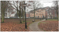
This is the scene where Melissa, Ruby and Olivia pay their respects to Jake by knotting a bunch of purple flowers against a pole with a message at a park. We chose this location because of the leafless trees which alludes to death and decay linking to the loss of Jake. Deep space is used in conjunction with a long shot to create a sense of emptiness and sadness because of Jake's death.

This is the scene where Melissa, Ruby and Olivia are sat down around a circular table playing with the Ouija board. we chose this location because of it's shallow space creating a claustrophobic atmosphere. The location was very ill-lit which allowed us to use a lamp to manipulate light and shadow (Chiaroscuro) to create an unnerving and foreboding sense.


This is the scene where Ruby is in a classroom working on the computer when Melissa suddenly decides s to ring her about finding a Ouija board. We chose this location because it establishes Ruby's occupation as a working student. You can see that the room is very modern with computers, a smart board and ergonomic chairs. The colour purple on the walls has negative connotations of death and mourning which is also used for the colour of the flowers.


This is the scene where Melissa is sat down revising and then suddenly decides to call Ruby about finding an Ouija board at a car boot sale and insists on trying it out. We chose this location because it also establishes Melissa's occupation as a student and in the background you can see the leafless trees again which signifies death and a road to foreshadow Jake's death.


This is the scene where Melissa is waiting to meet Jake at the car park with the suitcase she got from the car boot sale. Jake walks to meet her and the start looking through it with things such as old clothes and the main prop which is the Ouija board. We chose this location because it had desaturated colours and foreshadows Jake's death with the cars present in the setting.


This is the scene where Melissa is walking through the corridor whilst Jake is walking downstairs. Parallel editing was used to show the two journeys taking place at the same time. This is where they have a conversation about where to meet after college, to look through the suitcase which Melissa found at a car boot sale. We chose this location because it lacks colour since there is only black and white to convey a detached feel.